Layout requirements
"A layout design is the visually expressed ideas for the artistic and technical design of a label or package, in other words, it is a picture, the anticipated appearance of a product.
The original layout is a technical working document prepared on the basis of the approved design layout. The original layout must fully coincide with the future printed (manufactured) product sample - label or flexible packaging. The original layout is created in electronic form and conforms to the production and technical requirements for printed products.
Our designers take the utmost care in creating and inspecting your layouts. We pay attention to the order of approval of the original layout by the purchaser (it is important, please read it!) The original layout must be carefully checked, the text proofread and contact and other information (telephone numbers, e-mail, barcodes, expiry dates etc.) must be verified when the layout is approved. Spelling and punctuation errors in the original layout are the client's responsibility. Errors found in the finished product after the Customer's approval of the original layout may not serve as a reason for redoing the order. If the Customer needs to make changes to an already approved original layout, the Customer's Account Manager must be notified before the order is put into production. Technical details of the original layout: We accept files in Adobe Illustrator and CorelDRAW graphic editors; it is possible to provide a design layout in a pdf file. Fonts must be converted to "curves". Raster images should be saved in TIFF or Photoshop PSD formats, linked (Links/Links) and not embedded (Embedded/Embedded), saved separately from the page-proofs (as separate files) and available for editing in Photoshop. The resolution of raster objects must be at least 300 dpi, the scale of the raster images contained in the graphic editors must be 100%. The colour model for raster objects is RGB or CMYK (with an embedded profile or specifying a profile if a standard profile was used (e.g. Euroscale Coated)), vector objects are CMYK and/or Pantone. The Pantone designation must be in accordance with Pantone Formula Guides. Image elements for additional finishing processes such as selective lacquering, whitewashing, foil stamping, embossing, glue application, etc should be made as vector objects (with a few exceptions - for example, when whitewashing for special effects is made as an element of a bitmap image), filled in with separate spot colours and named with Russian names in Latin transcription (unlike colours which have names according to Pantone Formula Guides: for example it is not allowed to name colour zoloto or gold if it is colour Pantone 871 C etc.).
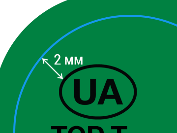
Example: belila, lak, kongrev, folga, kley, etc. The image for these processes must be located on a separate layer with the same name as the colour (e.g. for belila the image must be painted with a colour called belila and located on a layer called belila), visually the colour must be clearly distinguishable on the monitor screen and on the printout, the whiting must not be white. It is not allowed to have objects of another colour to form an image of additional finishing processes, for example the absence of the image is imitated by objects of white colour over objects painted by belila colour. The die-cutting accuracy of the label is 0.5mm. In the layout all relevant elements (especially text) should be at least 2 mm from the die-cut line. In the case of elements that can clearly emphasise the inaccuracy of the die-cut (contour lines), the distance should be increased to 4 mm.
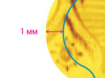
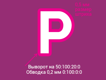
All image elements (both vector and raster) must be made with 1 mm over the cutting line. The minimum area of the raster element is %. You should take into consideration that colour gradients going from 100% filling to 0%, for example, will have a visible contrast strip at the place where 3% filling ends. To eliminate this, these areas will be filled at 3%, this will make the image appear slightly darker in the light areas. The minimum reproducible font size is 3 pt. (with and without serifs) minimum font size reproducible by serif in one colour, 5 pt, minimum font size reproducible in three colours - 12 pt (such mono-colour stroke with a thickness of 0.2-0.3 mm should be used for such text. This applies to text with an outline in 2 or more colours).

The minimum dot size is 0.2 mm. The minimum size of a dot made with a one-color reverse is 0.2 mm; in three colors 0.5 mm.
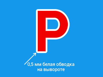
If there is a need to highlight the text with a white stroke on the background, then the thickness of the outline should be at least 0.5 mm.
The minimum stroke size reproduced by reverse in one color: 0.2 mm, in three colors 0.5 mm (it is not recommended to use small reverse fonts and graphic elements in multi-color backgrounds). A stroke in 2 or more colors is assigned a stroke with a thickness of 0.2 mm.


